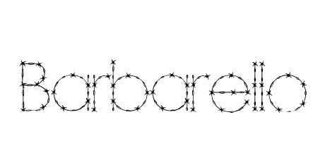
Barbarello: A font of captivating contrasts. Its elegant, almost delicate serifs are unexpectedly framed by a subtle, barbed-wire effect, creating a tension between fragility and strength. This juxtaposition lends a unique, slightly edgy charm, perfect for titles that demand both grace and a hint of rebellion.
\u00a9 2001, Su Lucas and Apostrophic Lab. All rights reserved. Email su@apostrophiclab.com or visit www.apostrophiclab.com for more information and more free fonts.