In the visually-driven world of social media, aesthetics play a crucial role in engaging audiences. From Instagram stories to Twitter posts, Facebook ads, and TikTok videos, the right font can significantly impact how a message is perceived. Brands, influencers, and casual users alike rely on fonts to convey tone, emotion, and brand identity. While imagery and video often steal the show, typography is an underrated tool that can make or break your content’s effectiveness.
Let’s explore the most popular fonts used across social media platforms, breaking down what makes them stand out and why they are so frequently chosen.
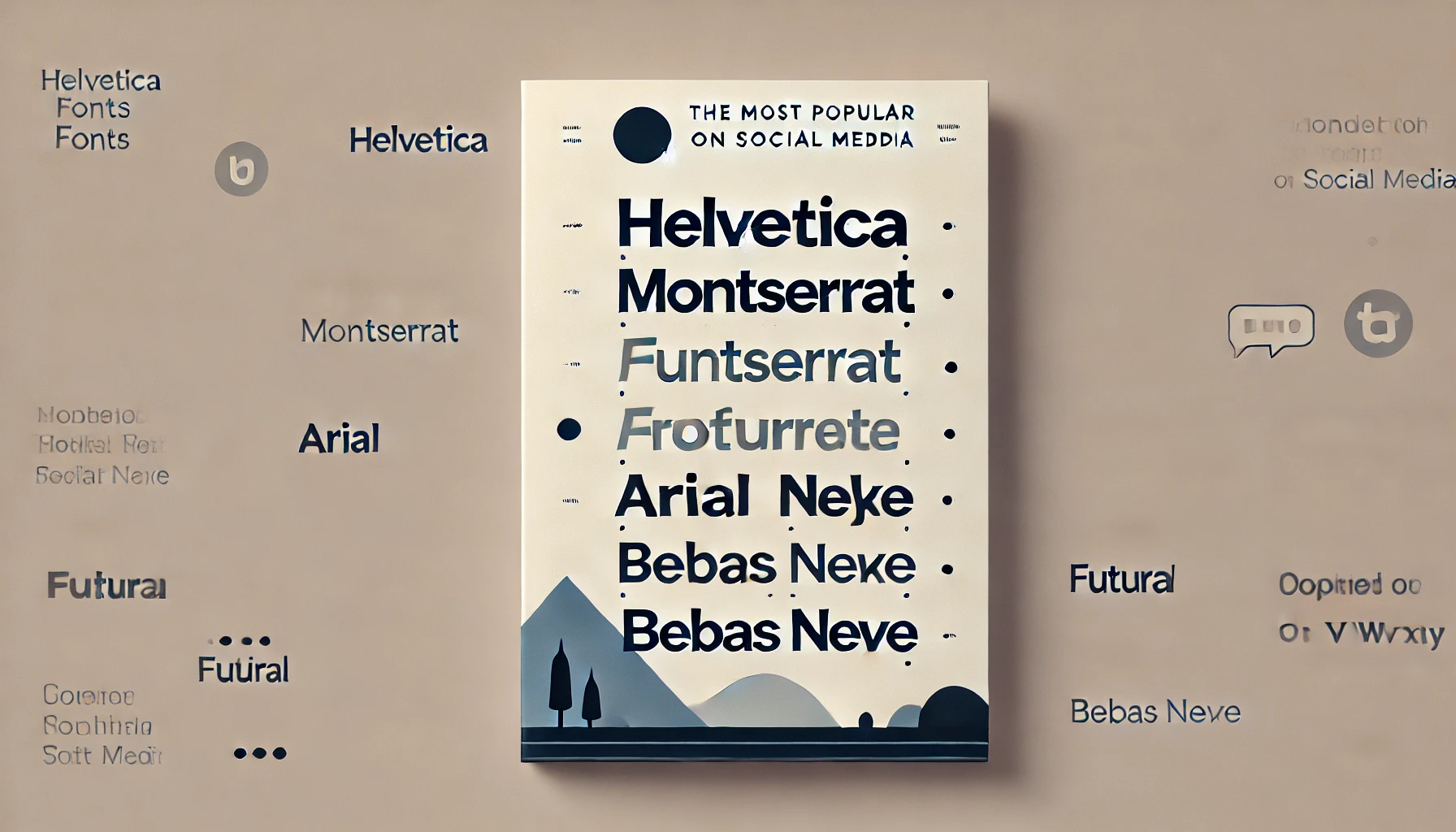
1. Helvetica
Widely considered one of the most timeless and versatile fonts, Helvetica remains a top choice for many social media users and brands. It’s simple, clean, and works well across a variety of contexts. Whether it’s used for Instagram captions, Facebook posts, or minimalist branding on Pinterest, Helvetica’s neutrality and readability make it a safe bet for conveying professionalism without being overly formal.
Why it’s popular:
- Neutral and easy to read.
- Compatible with various designs and color schemes.
- Versatile enough for corporate branding or personal use.
2. Montserrat
Montserrat is a modern geometric sans-serif font that has become increasingly popular in social media marketing, especially among startups and digital influencers. Its bold and stylish design gives it an edge while maintaining legibility, making it a go-to choice for logos, headlines, and product promotions on platforms like Instagram and TikTok.
Why it’s popular:
- Clean lines and modern feel.
- Works great for bold headlines or captions.
- Excellent readability in both small and large sizes.
3. Futura
Futura is another geometric sans-serif font that stands out on social media for its sleek, modern look. Its simplicity makes it ideal for minimalist designs, but its strong structure also allows it to shine in attention-grabbing headlines. Futura is often seen in branded posts, as it lends a sense of innovation and progress.
Why it’s popular:
- Gives a futuristic, progressive vibe.
- Pairs well with minimalist aesthetics.
- Effective for both display and body text.
4. Arial
Much like Helvetica, Arial is a staple of social media typography due to its simplicity and readability. Often used in Facebook and LinkedIn posts, Arial has become synonymous with professionalism. While it may not be the most adventurous choice, it’s reliable, making it perfect for informational content, like infographics or detailed captions.
Why it’s popular:
- Universally accessible and readable.
- Often seen as neutral and professional.
- Great for longer captions or posts with heavy text content.
5. Bebas Neue
For users looking to make bold statements, Bebas Neue is a frequent choice. This all-caps, condensed font is often found in Instagram story text overlays, YouTube thumbnails, and social media ads. It’s a powerful option when you want to emphasize strength, confidence, or urgency in your messaging.
Why it’s popular:
- Bold and attention-grabbing.
- Works well for headlines and short statements.
- Used frequently in YouTube thumbnails, Instagram ads, and motivational posts.
6. Times New Roman
Though it may seem old-fashioned, Times New Roman still holds its ground in the digital world, particularly on platforms where professionalism is a priority, like LinkedIn. This serif font evokes tradition and authority, making it a great choice for brands looking to establish credibility or for content focused on education, business, or editorial topics.
Why it’s popular:
- Classic and authoritative.
- Ideal for longer, formal posts.
- Often used by brands that want to convey trustworthiness and reliability.
7. Open Sans
A widely used Google font, Open Sans is perfect for both web and mobile readability, making it a favorite among social media marketers. Its clean design and high legibility ensure that text remains readable across devices, from Instagram captions to Facebook posts. It’s a versatile font that appeals to both casual and business users.
Why it’s popular:
- Highly legible on both desktop and mobile devices.
- Neutral and unobtrusive, allowing other design elements to shine.
- Commonly used for body text in posts, blogs, and longer content.
8. Roboto
Designed specifically for the web, Roboto has seen widespread adoption on platforms like Instagram and TikTok, where sleek, modern aesthetics are key. Its rounded edges and geometric design make it an approachable yet professional choice for both personal and business content. Roboto is a solid choice for captions, especially when paired with bright visuals.
Why it’s popular:
- Optimized for web use and mobile screens.
- Modern and approachable design.
- Often used in digital campaigns and app-based content.
9. Playfair Display
For those who want to add a touch of elegance to their social media posts, Playfair Display offers a more sophisticated and editorial look. It’s a serif font that pairs well with high-quality visuals, making it perfect for Instagram stories, blogs, or branded content aimed at high-end audiences. This font is often seen in the fashion, beauty, and lifestyle industries.
Why it’s popular:
- Adds a luxurious, elegant feel to posts.
- Often used by fashion and beauty influencers.
- Ideal for headlines and quotes.
10. Lobster
If you’ve ever seen a quirky, playful Instagram post or a lively YouTube thumbnail, chances are you’ve come across Lobster. This script font adds a friendly, whimsical touch to any design. While it’s not ideal for body text, Lobster is perfect for short headlines, quotes, or captions in vibrant, informal posts.
Why it’s popular:
- Fun, playful, and inviting.
- Ideal for casual, informal messaging.
- Often used for quotes, titles, and short text in creative designs.
Conclusion
Choosing the right font for social media content is about more than just aesthetics. Fonts carry personality and tone, influencing how your message is received by your audience. Whether you’re aiming for professional, playful, modern, or classic vibes, there’s a font that fits your style. The key is balancing readability with visual appeal, ensuring that your content resonates across devices and platforms. By understanding the strengths and common use cases of these popular fonts, you can better align your typography with your brand’s identity and audience expectations.
Leave a Reply