
When it comes to email marketing and design, subject lines get a lot of attention, but the visual impression of an email is just as critical—especially the font you use. The right font can make your email feel polished and on-brand, while the wrong one can hurt readability, disrupt brand consistency, and even reduce engagement.
This guide walks you through choosing an email-safe font, implementing fallback options, and testing across major email clients like Outlook, Gmail, Apple Mail, and more.
Why Fonts in Emails Matter
Your font choice directly impacts brand perception and engagement. Even a slight mismatch between your email fonts and your website can create a disjointed experience for recipients. Here’s why font selection matters:
Brand Consistency
Your brand’s typography is a key part of its identity. The fonts you use on your website, ads, and emails should be cohesive—otherwise, even minor inconsistencies can create a disjointed experience for recipients. If your email font doesn’t match what users expect, it can weaken brand recognition and make your message feel off-brand. A seamless visual experience helps reinforce your credibility and ensures that subscribers immediately associate your email with your company.
Readability & Engagement
Emails need to be easy to read across all devices and email clients. If your font is too small, too fancy, or poorly rendered, recipients won’t engage—they may even unsubscribe or ignore your CTA. Fonts impact how users consume information, and a hard-to-read font can cause frustration, leading to lost conversions. Choosing email-safe fonts and optimizing line height and contrast ensures that your message is clear and digestible.
The Data on Font & Design Consistency
Beyond just looking polished, font consistency directly impacts how subscribers engage with your emails. When typography aligns across all touchpoints, it builds familiarity and encourages users to take action.
Recent analysis has shown that emails maintaining brand consistency—right down to font selection—experience a significant boost in both click-through rates and overall ROI. When design elements align across all marketing channels, subscribers recognize and trust the brand more efficiently, leading to deeper engagement and higher conversions.
Common Font Types for Email
There’s no universal font that renders perfectly in all email clients, but understanding font types helps you make informed choices:
System Fonts (Widely Supported)
✔ Examples: Arial, Helvetica, Georgia, Times New Roman
✔ Pros: Available on nearly all devices, ensuring reliable rendering
❌ Cons: Limited branding impact; can look generic
Web-Safe Fonts (Expanded Options)
✔ Examples: Verdana, Trebuchet MS, Courier New
✔ Pros: Better design variety while still widely supported
❌ Cons: Some minor rendering inconsistencies across email clients
Custom/Web Fonts (Branded but Limited Support)
✔ Examples: Google Fonts, Adobe Fonts, self-hosted fonts
✔ Pros: Unique branding, modern and stylish appearance
❌ Cons: Not fully supported in Outlook desktop; requires fallback strategies
Fallback Strategies & Cross-Client Compatibility
Since not all email clients support custom fonts, implementing a fallback strategy ensures that your emails remain visually consistent and readable across different devices and platforms. Here’s how a typical fallback font stack works:
Using CSS @font-face
If your audience is mainly using modern email clients, you can try embedding a custom font:
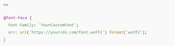
However, Outlook desktop does not support @font-face, so it’s essential to define fallback fonts.
Fallback Font Chains
A best practice is to use a font stack in your CSS:
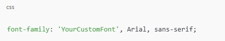
Each font in the stack serves as a backup if the one before it is unavailable. Here’s how the browser or email client processes it:
- If the recipient’s email client supports web fonts (such as Apple Mail, iOS Mail, or some versions of Gmail), your custom font will be displayed as intended. This ensures brand consistency by matching the typography used on your website and other digital assets.
- If the email client does not support custom fonts (such as Outlook for Windows), it will return to Arial. Arial is a system font available on nearly all devices, making it a safe choice for maintaining readability while still looking clean and professional. Though it may not have the unique branding of your custom font, it preserves the integrity of your email’s layout and design.
- In rare cases where Arial isn’t installed (such as some Linux distributions), the email client will default to a generic sans-serif font. This ensures that the text remains legible and avoids fallback to a serif font like Times New Roman, which could drastically alter your design’s appearance.
Testing Your Fonts Across Email Clients
To ensure your fonts render correctly:
- Use testing tools like Litmus, Email on Acid, or your ESP’s built-in preview
- Check rendering in top email clients (Gmail, Outlook, Apple Mail, Yahoo Mail, etc.)
- Test across desktop and mobile devices
Design Best Practices for Email Fonts
Even with the right font selection, your email’s typography needs to be optimized for readability:
Font Size & Line-Height
- For mobile: 14-16px for body text, 22-28px for headlines
- For desktop: 16-18px for body text, 24-32px for headlines
Contrast Matters
- Ensure high contrast between text and background (avoid light gray on white)
- Dark text on a light background is the safest choice for readability
Email-Specific Layout Considerations
- Whitespace: Keep line spacing at 1.4x – 1.6x the font size for better readability
- Bulletproof buttons: Use text-based buttons to ensure visibility if images are blocked
- Avoid all-image emails: Some clients disable images by default—your text should still be readable without them
Implementation Steps
Now that you understand font selection and fallbacks let’s walk through setting up a responsive email template:
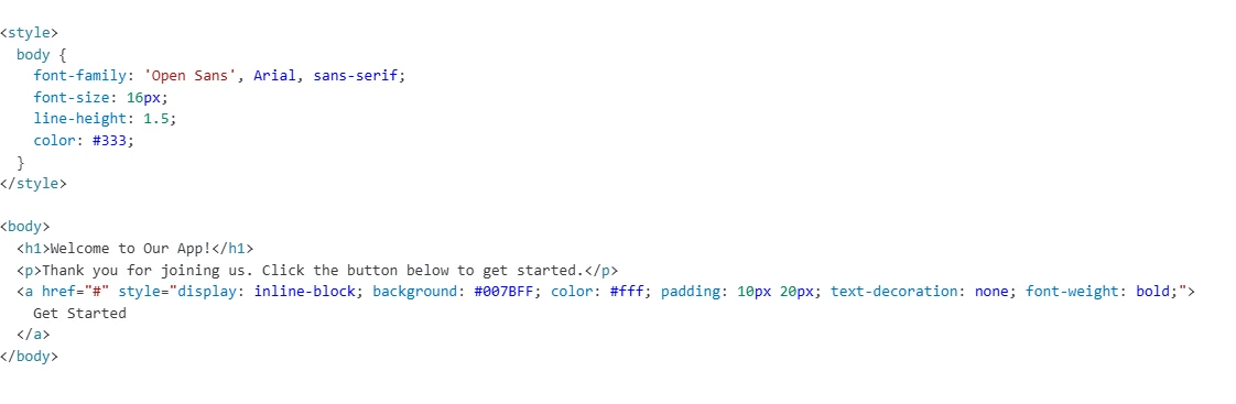 Step-by-Step Code Example
Final Checklist Before Sending
Before hitting send, ensure your email’s typography is optimized for readability, brand consistency, and cross-client compatibility. Use this final checklist to catch potential font-related issues and ensure a flawless user experience across all devices and email clients.
- Test in top email clients (Gmail, Outlook, Apple Mail, Yahoo, etc.)
Different email clients render fonts differently, so testing is essential to avoid unexpected changes in layout or readability. Use tools like Litmus or Email on Acid to preview how your email appears in multiple clients before sending.
- Ensure fallback fonts match the brand personality
Your fallback font should be as close as possible to your primary font in terms of style and feel. Example: If your brand uses a modern sans-serif font, choose Arial or Helvetica as a fallback instead of Times New Roman. If your brand typically uses a serif font, Georgia or Times New Roman will maintain a similar feel.
- Keep email file size optimized (limit custom font loads)
Loading multiple web fonts can increase email size and slow down rendering, especially on mobile devices or slower connections. Keep your custom font file lightweight and avoid using too many different font styles in a single email. Remove unused font weights (e.g., if you only need Regular and Bold, don’t load Light, Semi-Bold, or Extra-Bold).
The Right Font Strategy is Essential for Email Success
Choosing the right font for your emails is more than just a design decision—it directly impacts brand perception, readability, and engagement. A well-chosen font ensures that your emails are visually appealing, easy to read, and aligned with your brand identity across different devices and email clients.
Here’s what to remember:
- Stick to system or web-safe fonts for reliability.
- If using custom fonts, always include a fallback to prevent display issues.
- Test your emails across multiple clients like Gmail, Outlook, and Apple Mail to ensure consistent rendering
- Optimize font size and contrast for readability, especially on mobile devices.
- Limit font file sizes to keep email load times fast and avoid performance issues.
At the end of the day, your typography choices shape how recipients perceive and engage with your brand. Well-optimized email fonts don’t just make your emails look good—they increase click-through rates, enhance user experience, and strengthen brand recognition.
Leave a Reply