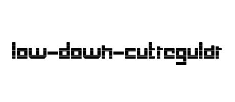
Low-Down-Cut Regular boasts a bold, geometric sans-serif design. Its thick, blocky strokes create a strong, almost monospaced feel. The letters are tightly spaced, giving it a compressed, dense appearance. It suggests a sense of power and directness, possibly suitable for headlines or branding with a modern, industrial aesthetic.
�
! " ' + , - . 0 1 2 3 4 5 6 7 8 9 : ; = ? A B C D E F G H I J K L M N O P Q R S T U V W X Y Z [ ] _ a b c d e f g h i j k l m n o p q r s t u v w x y z { | } ~ Ä Ö Ü ä ö ü ‘ ’ “ ”