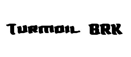
Turmoil BRK exudes a bold, slightly irregular energy. The letters are chunky and uneven, suggesting a hand-drawn or distressed aesthetic. The "Turmoil" section has a more organic, almost distressed feel, while "BRK" is more tightly formed but shares the same bold weight. The overall style conveys a sense of chaos tempered by a strong, forceful presence.
! " % & ' ( ) + , - . 0 1 2 3 4 5 6 7 8 9 = ? @ A B C D E F G H I J K L M N O P Q R S T U V W X Y Z [ ] a b c d e f g h i j k l m n o p q r s t u v w x y z Æ æ